Chapter 4 Wrangle and graph New York City flights
Install the nycflights23 package, containing data on flights in and out of New York City’s airports in 2023.
The package does not contain any functions, just data.
Load the nycflights23 package
view flights
## # A tibble: 435,352 × 19
##     year month   day dep_time sched_dep_time dep_delay arr_time sched_arr_time
##    <int> <int> <int>    <int>          <int>     <dbl>    <int>          <int>
##  1  2023     1     1        1           2038       203      328              3
##  2  2023     1     1       18           2300        78      228            135
##  3  2023     1     1       31           2344        47      500            426
##  4  2023     1     1       33           2140       173      238           2352
##  5  2023     1     1       36           2048       228      223           2252
##  6  2023     1     1      503            500         3      808            815
##  7  2023     1     1      520            510        10      948            949
##  8  2023     1     1      524            530        -6      645            710
##  9  2023     1     1      537            520        17      926            818
## 10  2023     1     1      547            545         2      845            852
## # ℹ 435,342 more rows
## # ℹ 11 more variables: arr_delay <dbl>, carrier <chr>, flight <int>,
## #   tailnum <chr>, origin <chr>, dest <chr>, air_time <dbl>, distance <dbl>,
## #   hour <dbl>, minute <dbl>, time_hour <dttm>
4.1 Which carriers should travelers avoid?
Analysis goal: which flight carriers should travelers avoid? Let’s explore what goes on at different airports with different carriers.
NYTIMES story about change in delay time!
How often is a flight delayed? This answer may be subjective. Let’s define flight delays as arriving any amount of time after scheduled
Make a histogram of arrival delays. pressing “tab” can open an auto-fill menu
## `stat_bin()` using `bins = 30`. Pick better value with `binwidth`.## Warning: Removed 12534 rows containing non-finite outside the scale range
## (`stat_bin()`).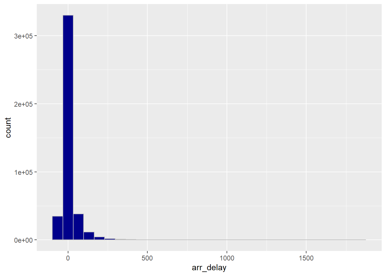
Let’s limit the graph to the section with the most data
ggplot(flights) +
  geom_histogram(aes(x = arr_delay),
                 fill = "darkblue",
color = "grey") +
xlim(-100, 300)## `stat_bin()` using `bins = 30`. Pick better value with `binwidth`.## Warning: Removed 14636 rows containing non-finite outside the scale range
## (`stat_bin()`).## Warning: Removed 2 rows containing missing values or values outside the scale
## range (`geom_bar()`).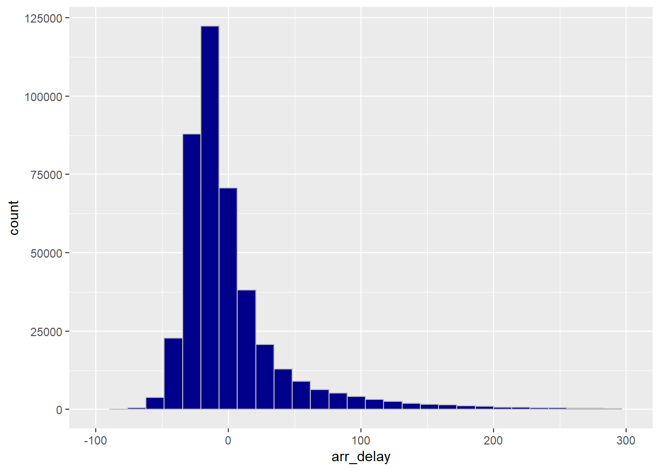
4.2 Data Wrangling
Manipulating data…
Let’s calculate the proportion of delayed flights
- Data wrangling functions are English words that suggest what you’re doing with the data
Create a new column indicating whether flight was delayed
mutate function does this to a dataset.
Below, we calculate a new column, was_flight_delayed and fill it in with TRUE if arr_delay is greater than 0, and FALSE if it is not.
## # A tibble: 435,352 × 20
##     year month   day dep_time sched_dep_time dep_delay arr_time sched_arr_time
##    <int> <int> <int>    <int>          <int>     <dbl>    <int>          <int>
##  1  2023     1     1        1           2038       203      328              3
##  2  2023     1     1       18           2300        78      228            135
##  3  2023     1     1       31           2344        47      500            426
##  4  2023     1     1       33           2140       173      238           2352
##  5  2023     1     1       36           2048       228      223           2252
##  6  2023     1     1      503            500         3      808            815
##  7  2023     1     1      520            510        10      948            949
##  8  2023     1     1      524            530        -6      645            710
##  9  2023     1     1      537            520        17      926            818
## 10  2023     1     1      547            545         2      845            852
## # ℹ 435,342 more rows
## # ℹ 12 more variables: arr_delay <dbl>, carrier <chr>, flight <int>,
## #   tailnum <chr>, origin <chr>, dest <chr>, air_time <dbl>, distance <dbl>,
## #   hour <dbl>, minute <dbl>, time_hour <dttm>, was_flight_delayed <lgl>
count function counts things!
## # A tibble: 3 × 2
##   was_flight_delayed      n
##   <lgl>               <int>
## 1 FALSE              281244
## 2 TRUE               141574
## 3 NA                  12534
The missing values are cancelled flights! It’s important to investigate NAs: What do they mean? Why are they missing? What should we do with this information in the context of the research question?
4.3 On average, how long are flights delayed?
summarize allows us to calculate summary statistics
## # A tibble: 1 × 1
##   average_flight_delay
##                  <dbl>
## 1                 4.34
Out of all flights, the average delay is 4.34
But of the flights that are delayed, what is the average delay time?
filter can filter out rows of the dataset
## # A tibble: 141,574 × 19
##     year month   day dep_time sched_dep_time dep_delay arr_time sched_arr_time
##    <int> <int> <int>    <int>          <int>     <dbl>    <int>          <int>
##  1  2023     1     1        1           2038       203      328              3
##  2  2023     1     1       18           2300        78      228            135
##  3  2023     1     1       31           2344        47      500            426
##  4  2023     1     1       33           2140       173      238           2352
##  5  2023     1     1       36           2048       228      223           2252
##  6  2023     1     1      537            520        17      926            818
##  7  2023     1     1      549            559       -10      905            901
##  8  2023     1     1      605            600         5      906            855
##  9  2023     1     1      611            530        41      923            839
## 10  2023     1     1      619            620        -1      751            745
## # ℹ 141,564 more rows
## # ℹ 11 more variables: arr_delay <dbl>, carrier <chr>, flight <int>,
## #   tailnum <chr>, origin <chr>, dest <chr>, air_time <dbl>, distance <dbl>,
## #   hour <dbl>, minute <dbl>, time_hour <dttm>
Here are just the 141k… flights that were delayed
Shall we now summarize the average delay of the delayed flights ?
## # A tibble: 1 × 1
##   average_flight_delay
##                  <dbl>
## 1                 50.3
Aha, there’s an average of 50 minutes delay!
What is the average flight delay time for each carrier?
group_by allows you to calculate summaries for subgroups of the data all at once
First, let’s group the flight record by carrier
Next, let’s summarize average delay time
## # A tibble: 14 × 2
##    carrier average_flight_delay
##    <chr>                  <dbl>
##  1 9E                   -2.23
##  2 AA                    5.27
##  3 AS                    0.0844
##  4 B6                   15.6
##  5 DL                    1.64
##  6 F9                   26.2
##  7 G4                   -5.88
##  8 HA                   21.4
##  9 MQ                    0.119
## 10 NK                    9.89
## 11 OO                   13.7
## 12 UA                    9.04
## 13 WN                    5.76
## 14 YX                   -4.64
When data wrangling, we can chain multiple functions together in a sequence
4.4 Pipe Operator
It looks like this: |> ctrl + shift + m (change global options -> code to use this)
The pipe takes the result of whatever is on the left, and inserts it as the first argument to the next function. More efficiently, we can group and summarize all at once.
## # A tibble: 14 × 2
##    carrier average_flight_delay
##    <chr>                  <dbl>
##  1 9E                   -2.23
##  2 AA                    5.27
##  3 AS                    0.0844
##  4 B6                   15.6
##  5 DL                    1.64
##  6 F9                   26.2
##  7 G4                   -5.88
##  8 HA                   21.4
##  9 MQ                    0.119
## 10 NK                    9.89
## 11 OO                   13.7
## 12 UA                    9.04
## 13 WN                    5.76
## 14 YX                   -4.64
We can modify that sequence to also filter by flights that are in fact delayed. Marcus asked about difference between spacing lines out with commas (for many parameters) and spacing out with piping
flights |>
  filter(arr_delay > 0) |>
  group_by(carrier) |>
  summarize(average_flight_delay = mean(arr_delay, na.rm=TRUE))
## # A tibble: 14 × 2
## carrier average_flight_delay
## <chr> <dbl>
## 1 9E 43.9
## 2 AA 55.9
## 3 AS 47.7
## 4 B6 58.1
## 5 DL 52.0
## 6 F9 67.5
## 7 G4 43.2
## 8 HA 45.0
## 9 MQ 27.7
## 10 NK 54.7
## 11 OO 60.7
## 12 UA 50.1
## 13 WN 36.8
## 14 YX 39.84.5 Warmup Question
What is the average flight time in the air of Delta flights leaving each of the three NYC airports? Answer with a graph
==is the logical comparison “equals to” whereas=assigns a new value"DL"is in quotes because it is a text string- need to use
mean()inside ofsummarize()because the input is a full dataset, not just a vector list - need to use
geom_col()rather than geom_bar() because we already know the y value. geom_bar() is for when you still need to count the values
flights |>
  filter(carrier == "DL") |>
  group_by(origin) |>
  summarize(average_air_time = mean(air_time, na.rm = TRUE)) |>
  ggplot() +
  geom_col(aes(x = origin, y = average_air_time))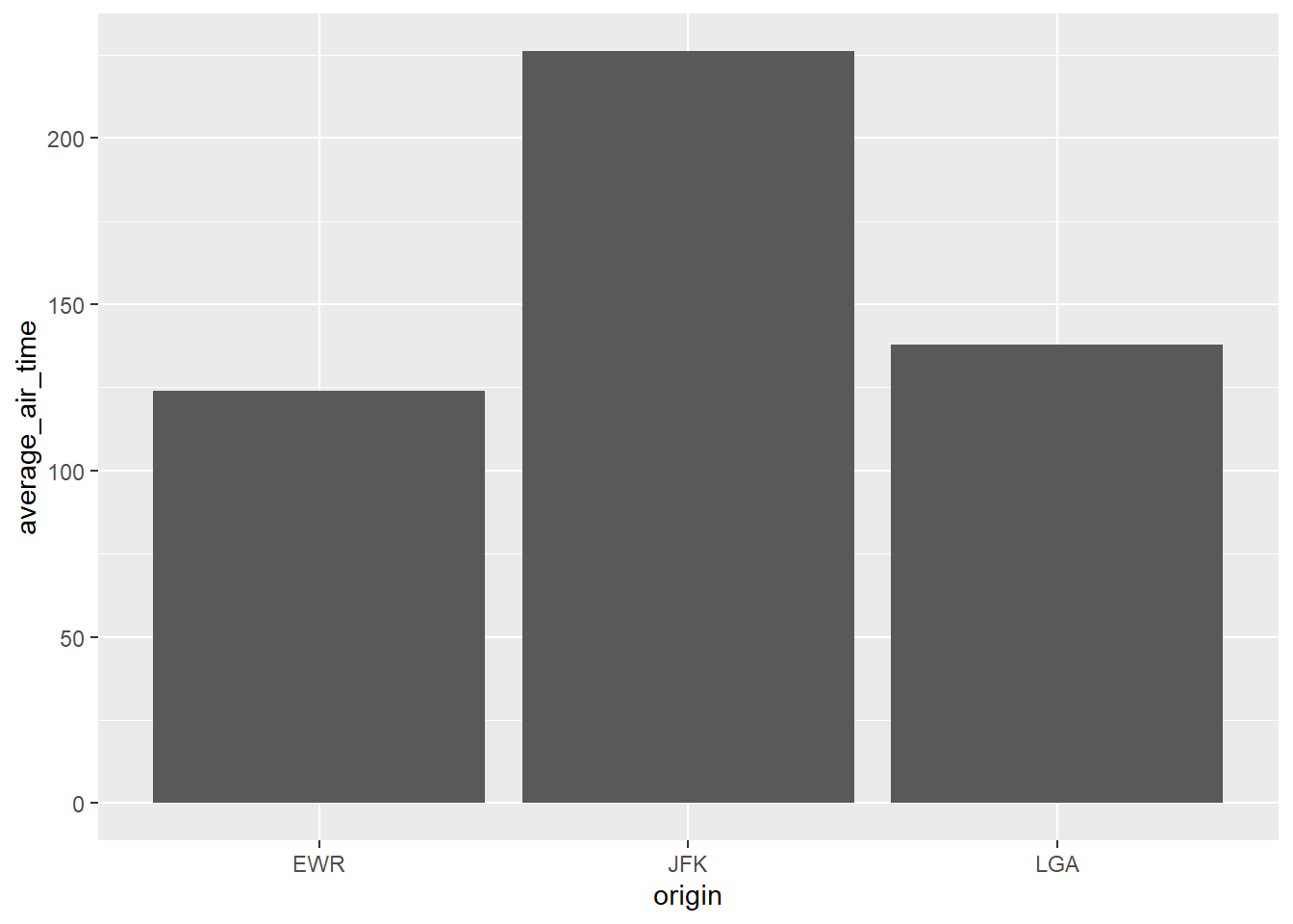
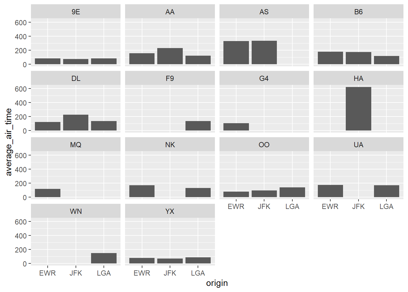
Lets’s create this column graph for all the carriers Group by both origin and carrier
flights |>
  #filter(carrier == "DL") |>
  group_by(origin, carrier) |>
  summarize(average_air_time = mean(air_time, na.rm = TRUE)) |>
  ggplot() +
  geom_col(aes(x = origin, y = average_air_time)) +
  facet_wrap(~carrier)
## `summarise()` has grouped output by 'origin'. You can override using
## the `.groups` argument.