Chapter 3 Graph values and qualities of diamonds
- there are many different functions / ways to explore data and graph it
- these may be the most common/efficient/best ways, but there might be more specialized ways out there
3.1 Install the tidyverse package
- install the tidyverse package with
install.packages
- use
libraryfunction to load installed packages intoR - needs to be run every time you start an R session
- more efficient for R to load only the packages you need for a particular session / analysis
3.2 Explore Diamonds Dataset
- diamonds is a dataset installed along with
tidyverse
## # A tibble: 53,940 × 10
##    carat cut       color clarity depth table price     x     y     z
##    <dbl> <ord>     <ord> <ord>   <dbl> <dbl> <int> <dbl> <dbl> <dbl>
##  1  0.23 Ideal     E     SI2      61.5    55   326  3.95  3.98  2.43
##  2  0.21 Premium   E     SI1      59.8    61   326  3.89  3.84  2.31
##  3  0.23 Good      E     VS1      56.9    65   327  4.05  4.07  2.31
##  4  0.29 Premium   I     VS2      62.4    58   334  4.2   4.23  2.63
##  5  0.31 Good      J     SI2      63.3    58   335  4.34  4.35  2.75
##  6  0.24 Very Good J     VVS2     62.8    57   336  3.94  3.96  2.48
##  7  0.24 Very Good I     VVS1     62.3    57   336  3.95  3.98  2.47
##  8  0.26 Very Good H     SI1      61.9    55   337  4.07  4.11  2.53
##  9  0.22 Fair      E     VS2      65.1    61   337  3.87  3.78  2.49
## 10  0.23 Very Good H     VS1      59.4    61   338  4     4.05  2.39
## # ℹ 53,930 more rows- Let’s graph the weight of a diamond against its $ value using the
ggplotfunction - Call up help on a function or package with a
?followed by a function name in the console. For example,?ggplotbrings up help on the graph plotting function. - creates a graphing object, in which all arguments are optional
- ggplot technically does not need any parameters (to make a blank graph
- graphing is like painting layers on a canvas
ggplot()starts a blank graphing canvas, on which you add data and aesthetic options.- add layers to ggplot with
+ - check out ggplot cheat sheet pdf from posit.co
- help documentation and cheat sheet shows what you can customize
- let’s make a scatterplot with
geom_point - we need to give a dataset to ggplot and define x and y coordinates
aestells R to make aesthetics using columns in your dataset
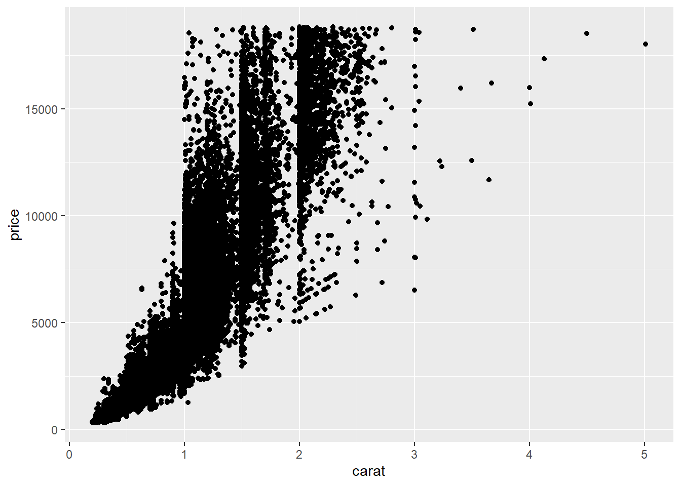
Let’s interpret the graph
- price increases with carat weight
- clustering of data on thresholds: 1 carat, 1.5 carats, 2 carats
- you need domain knowledge (content expertise) to explain patterns
- more variation in price as weight increases
Reflection
- Every graph will have this fundamental code structure, with modifications
- copy code you have that works and modify what you need!

Try graphing three variables: diamond color, carat and price. How could we approach this?
- use scatterplot and symbolize the dots
ggplot(data = arrange(diamonds, desc(color))) + geom_point(aes(x = carat, y = price, color = color))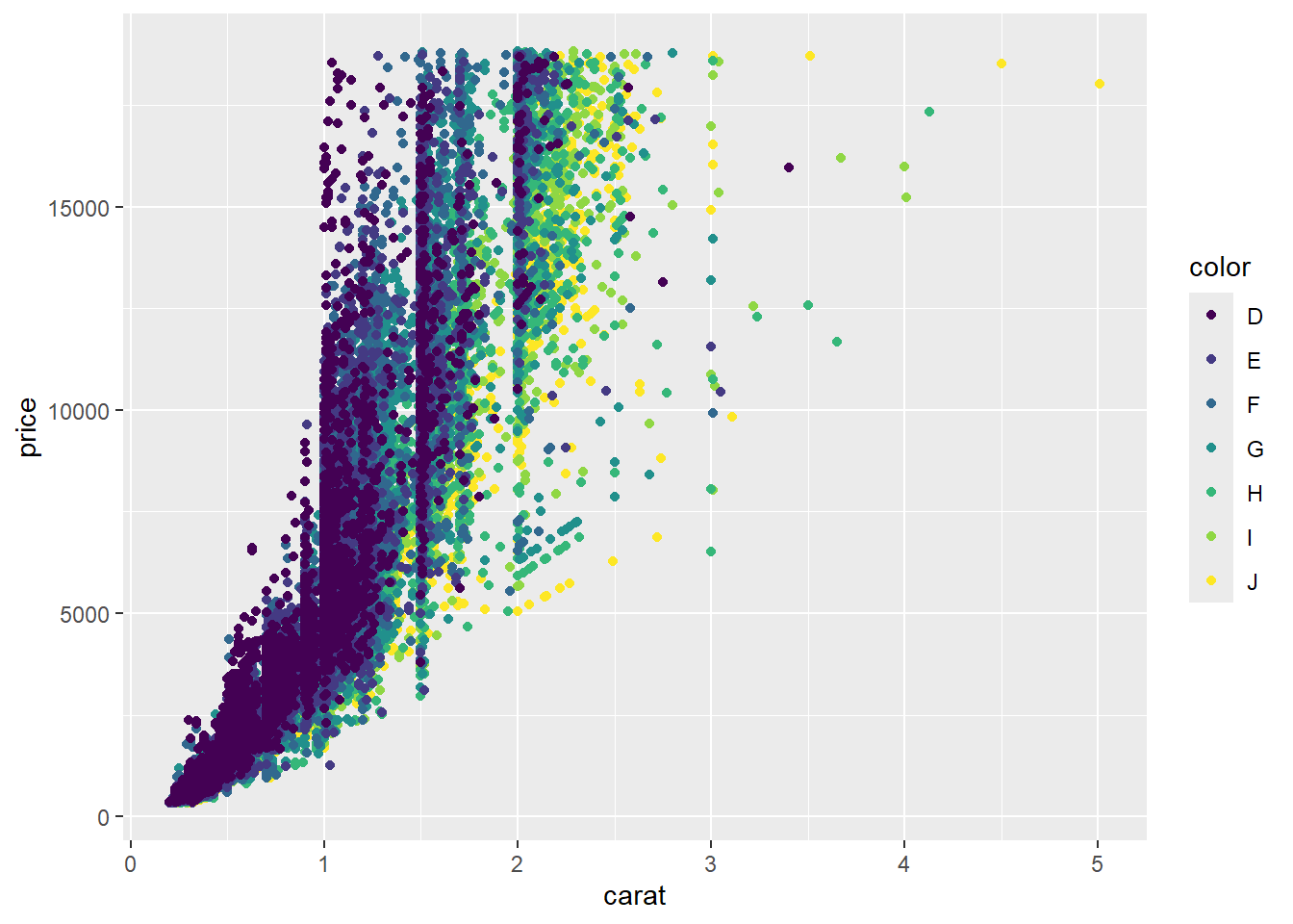
Interpret:
D appears more valuable than J
Few instances of very large D diamonds
Note that ggplot adds each color series one by one
many +’s in console indicates one of your lines of code is incomplete (missing parenthesis, started line with a +, etc.)
3.3 Facet the data
subdivide the data by a variable & create different graphs for each subgroup
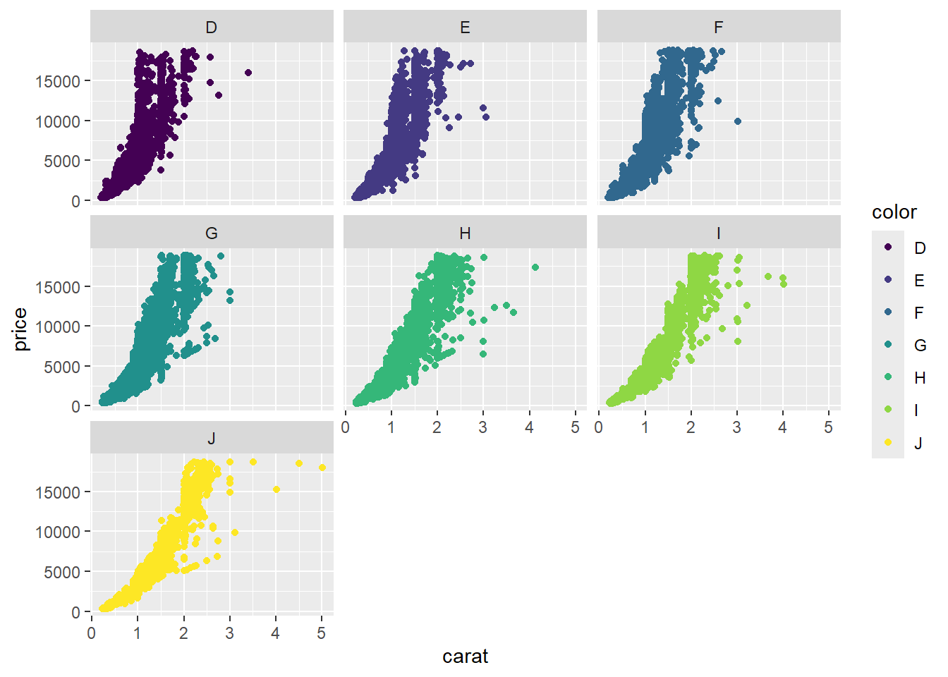
Interpret:
now it’s possible to analyze trends of each color separately
maybe facet by cut instead
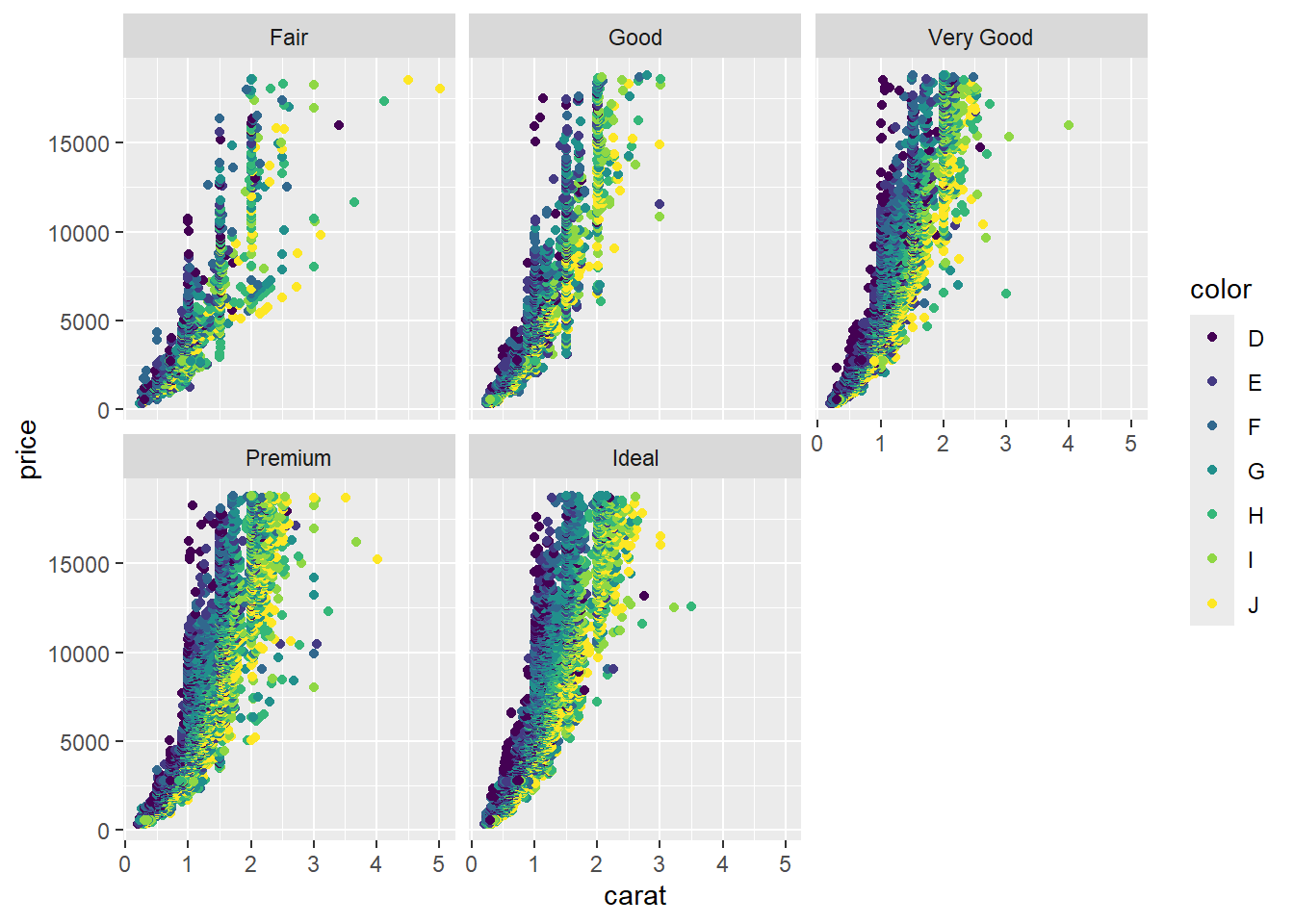
Interpret:
- as cut improves, price gets better
- price improves faster by carat for better cuts
ggplot(data = diamonds) +
  geom_point(aes(x = carat, y = price, color = color)) +
  facet_grid(clarity~cut)
Interpret:
- Each column represents a cut, and each row represents a color
- This visualization shows 5 variables
- IF is more clear (valuable) than I1
3.4 Restart R and Remake last graph
If you get an error about a function not being found, you either mistyped its name or more likely, you need to load the library in which the function is found. You need to do this every time you open a new R session.
ggplot(data = diamonds) +
  geom_point(aes(x = carat, y = price, color = color)) +
  facet_grid(clarity~cut)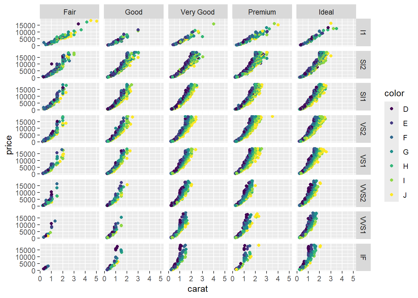
ctrl+shift+r can add a section to an R script. Headings take the place of that in Rmd
3.5 Explore gap in prices between 1k and 2k
Let’s make a histogram showing the distribution of a single quantitative variable
## `stat_bin()` using `bins = 30`. Pick better value with `binwidth`.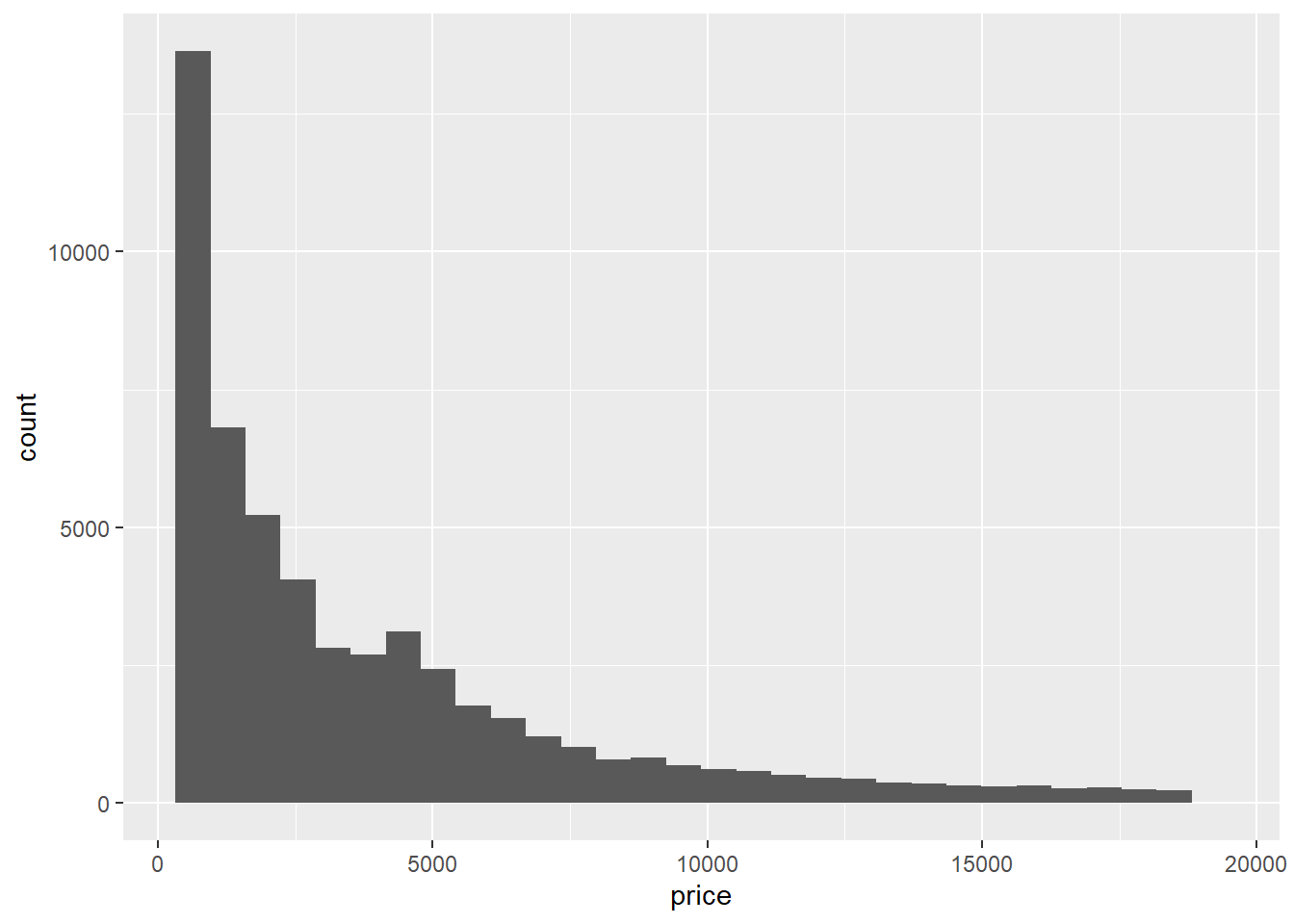 There’s your basic histogram.
Graph shows the aggregation of diamond data; each bar’s width represents a price range.
and its height represents the number of data points within that price range.
There’s your basic histogram.
Graph shows the aggregation of diamond data; each bar’s width represents a price range.
and its height represents the number of data points within that price range.
Interpretation: the vast majority of diamonds cost less than 2k, and a few diamonds cost more
We can optionally change the fill and outline colors.
## `stat_bin()` using `bins = 30`. Pick better value with `binwidth`.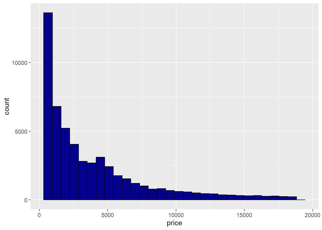
Let’s “zoom in” on the area of data with a gap in prices by changing the limits of the x-axis to 1000 and 2000
ggplot(data = diamonds) +
  geom_histogram(aes(x = price),
                 fill = "darkblue",
color = "black") +
xlim(1000, 2000)## `stat_bin()` using `bins = 30`. Pick better value with `binwidth`.## Warning: Removed 44232 rows containing non-finite outside the scale range
## (`stat_bin()`).## Warning: Removed 2 rows containing missing values or values outside the scale
## range (`geom_bar()`).
Data science cannot tell us why this price gap exists: you need domain knowledge to explain.