Chapter 12 Hurricane Dorian
Install packages
install.packages("tidyverse")
install.packages("here")
install.packages("tidytext")
install.packages("tm")
install.packages("igraph")
install.packages("ggraph")
install.packages("qdapRegex")
Load packages
12.0.1 Load and organize data
Check & create private data folder
if(!dir.exists(here("data_private"))) {dir.create(here("data_private"))}
if(!dir.exists(here("data_public"))) {dir.create(here("data_public"))}
Set up data
Create a file path for Dorian data
# set file path
dorianFile <- here("data_private", "dorian_raw.RDS")
# show the file path
dorianFile
## [1] "C:/GitHub/opengisci/wt25_josephholler/data_private/dorian_raw.RDS"Check if Dorian data exists locally. If not, download the data.
Check if Dorian data exists locally. If not, download the data.
if(!file.exists(dorianFile)){
  download.file("https://geography.middlebury.edu/jholler/wt25/dorian/dorian_raw.RDS",
                dorianFile,
                mode="wb")
  }
Load Dorian data from RDS file
View Dorian data column names
Save Dorian data column names to a CSV file for documentation and reference
12.1 Temporal analysis
What data format is our created_at data using?
Try the str function to reveal the structure of a data object.
$ picks out a column of a data frame by name
## POSIXct[1:209387], format: "2019-09-10 19:22:34" "2019-09-10 19:22:34" "2019-09-10 17:14:39" ...Twitter data’s created_at column is in the POSIXct date-time format.
Underneath the hood, all date-time data is stored as the number of seconds since January 1, 1970.
We wrap that data around functions to transform it into human-readable formats.
This format does not record a time zone and uses UTC for its time.
Let’s convert that into local (EST) time for the majority of the region of interest using the with_tz function, part of the lubridate package that comes with tidyverse.
Try graphing the tweets over time using geom_histogram.
Once you get one graph working, keep copying the code into the subsequent block to make improvements.
## `stat_bin()` using `bins = 30`. Pick better value with `binwidth`.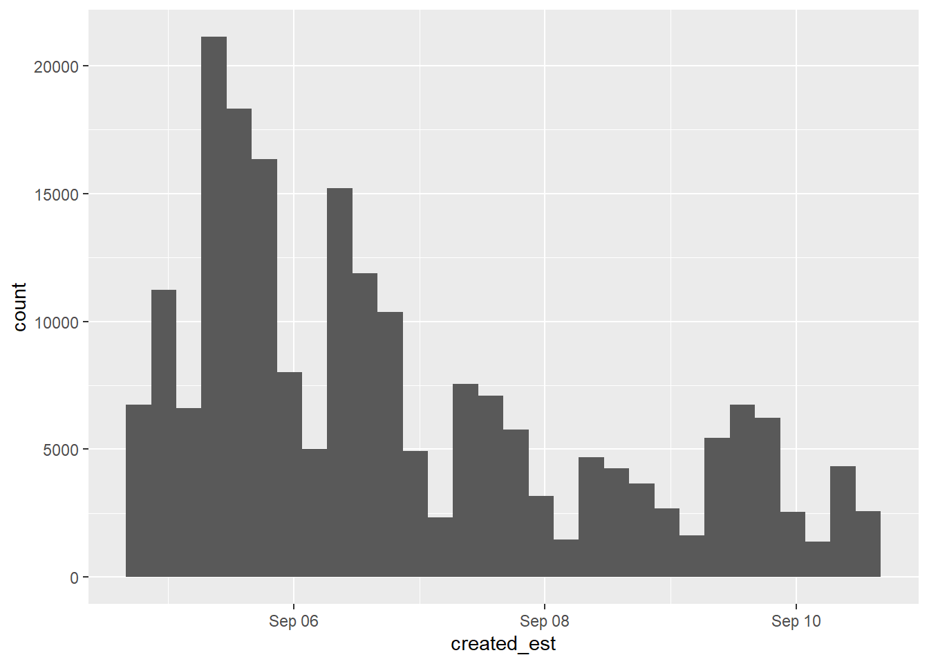
How are the number of bins– and therefore the bin widths– defined?
How is the x-axis formatted?
12.1.1 Customize bin widths
To control bin widths,geom_histogram accepts a binwidth parameter assuming the units are in seconds.
Try setting the bin width to one hour, and create the graph.
Try setting the bin width to 6-hour intervals, or even days.

Reset the bin width to one hour (3600 seconds) before moving on.
12.1.2 Customize a date-time axis
To control a date-time x-axis, try adding a scale_x_datetime function.
Add a date_breaks parameter with the value "day" to label and display grid lines for each day.
Add a date_labels parameter to format labels according to codes defined in strptime.
Look up documentation with ?strptime.
Try "%b-%d" for a label with Month abbreviation and day.
Add a name parameter to customize the x-axis label.
dorian_est |>
  ggplot() +
geom_histogram(aes(x = created_est), binwidth = 3600) +
scale_x_datetime(date_breaks = "day",
date_labels = "%b-%d",
name = "time")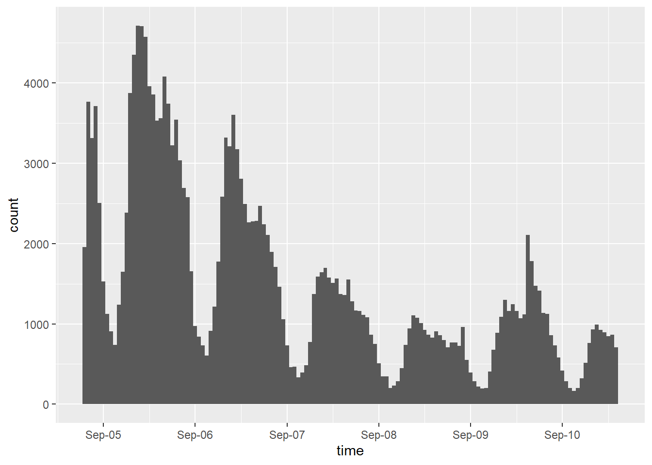
Now, try limiting the x-axis to fewer days, e.g. Sept 5 through Sept 8.
scale_x_datetime accepts a limits parameter as a list of two dates.
You can create an eastern time zone date with as.POSIXct("2019-09-05", tz="EST")
dorian_est |>
  ggplot() +
  geom_histogram(aes(x = created_est), binwidth = 3600) +
  scale_x_datetime(date_breaks = "day",
                   date_labels = "%b-%d",
                   name = "time",
                   limits = c(as.POSIXct("2019-09-06", tz="EST"),
                              as.POSIXct("2019-09-09", tz="EST")
                              )
                   )
## Warning: Removed 118438 rows containing non-finite outside the scale range
## (`stat_bin()`).## Warning: Removed 2 rows containing missing values or values outside the scale
## range (`geom_bar()`).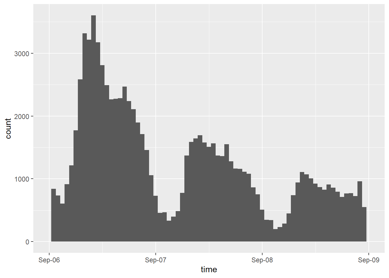
Finally, let’s remove the x-axis limits and switch from geom_histogram to geom_freqpoly
dorian_est |>
  ggplot() +
  geom_freqpoly(aes(x = created_est), binwidth = 3600) +
  scale_x_datetime(date_breaks = "day",
                   date_labels = "%b-%d",
                   name = "time")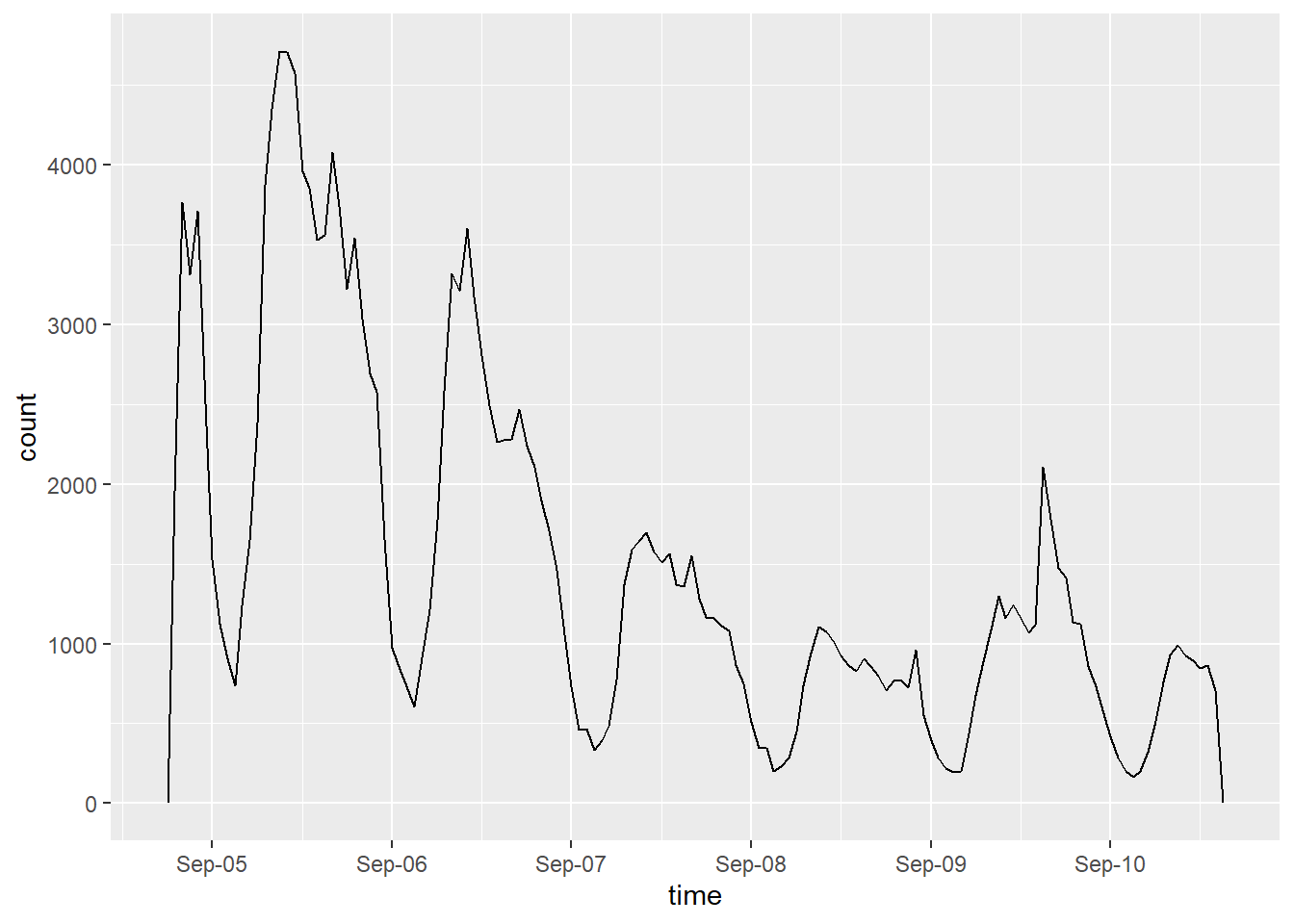
Note that temporal data can be binned into factors using the cut function.
look up cut.POSIXt
12.2 Text analysis
Tokenize the tweet content
dorian_words <- dorian_raw |>
  select(status_id, text) |>
  mutate(text = rm_hash(rm_tag(rm_twitter_url(tolower(text))))) |>
  unnest_tokens(input = text, output = word, format = "html")
Remove stop words
Remove search terms and junk words
junk <- c("hurricane",
          "sharpiegate",
          "dorian",
          "de",
          "https",
          "hurricanedorian",
          "por",
          "el",
          "en",
          "las",
          "del")

dorian_words_cleaned <- dorian_words_cleaned |>
  filter(!(word %in% junk)) |>
  filter(!(word %in% stop_words$word))
12.2.1 Graph word frequencies
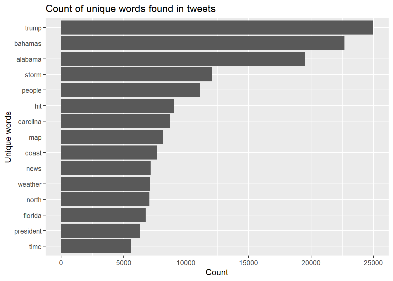
dorian_words_cleaned %>%
  count(word, sort = TRUE) %>%
  head(15) %>%
  mutate(word = reorder(word, n)) %>%
  ggplot() +
  geom_col(aes(x = n, y = word)) +
  xlab(NULL) +
  labs(
    x = "Count",
    y = "Unique words",
    title = "Count of unique words found in tweets"
  )
12.2.2 Graph word associations
create n-gram data structure n-grams create pairs of co-located words wrapper function: unnest_ngrams skip_ngrams forms pairs separated by a defined distance
It would be keen to remove @ handles here as well. Also consider removing Spanish stop words https://kshaffer.github.io/2017/02/mining-twitter-data-tidy-text-tags/
dorian_text_clean <- dorian_raw |>
  select(text) |>
  mutate(text_clean = rm_hash(rm_tag(rm_twitter_url(tolower(text)))),
         text_clean = removeWords(text_clean, stop_words$word),
         text_clean = removeWords(text_clean, junk))
Separate and count ngrams
dorian_ngrams <- dorian_text_clean |>
  unnest_tokens(output = paired_words,
                input = text_clean,
                token = "ngrams") |>
  separate(paired_words, c("word1", "word2"), sep = " ") |>
  count(word1, word2, sort = TRUE)
## Warning: Expected 2 pieces. Additional pieces discarded in 1398438 rows [1,
## 2, 3, 4, 5, 6, 7, 8, 9, 10, 11, 12, 13, 14, 15, 16, 17, 18, 19, 20,
## ...].Graph ngram word associations
# graph a word cloud with space indicating association.
# you may change the filter to filter more or less than pairs with 25 instances
dorian_ngrams %>%
  filter(n >= 500 & !is.na(word1) & !is.na(word2)) %>%
  graph_from_data_frame() %>%
  ggraph(layout = "fr") +
  geom_edge_link(aes(edge_alpha = n, edge_width = n)) +
  geom_node_point(color = "darkslategray4", size = 3) +
  geom_node_text(aes(label = name), vjust = 1.8, size = 3) +
  labs(
    title = "Hurricane Dorian Word Associations",
    x = "", y = ""
  ) +
  theme(
    plot.background = element_rect(
    fill = "grey95",
    colour = "black",
    size = 1
    ),
    legend.background = element_rect(fill = "grey95")
  )
## Warning: The `size` argument of `element_rect()` is deprecated as of ggplot2
## 3.4.0.
## ℹ Please use the `linewidth` argument instead.
## This warning is displayed once every 8 hours.
## Call `lifecycle::last_lifecycle_warnings()` to see where this
## warning was generated.## Warning: The `trans` argument of `continuous_scale()` is deprecated as of
## ggplot2 3.5.0.
## ℹ Please use the `transform` argument instead.
## This warning is displayed once every 8 hours.
## Call `lifecycle::last_lifecycle_warnings()` to see where this
## warning was generated.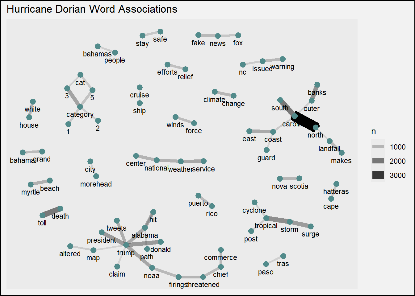
12.3 Geographic analysis
Install and load packages for spatial analysis to the beginning of your markdown document, including:
sffor simple (geographic vector) featurestmapfor thematic mappingtidycensusfor acquiring census data
Load packages
12.3.1 Construct geographic points from tweets
Before conducting geographic analysis, we need to make geographic points for those Tweets with enough location data to do so. Our end goal will be to map Twitter activity by county, so any source of location data precise enough to pinpoint a user’s county will suffice. The three primary sources of geographic information in tweets are: - Geographic coordinates from location services - Place names that users tag to a specific tweet - Location description in users’ profiles
12.3.2 Location services
The most precise geographic data is the GPS coordinates from a device with location services, stored in the geo_coords column, which contains a vector of two decimal numbers.
In data science, unnest refers to actions in which when complex content from a single column is parsed out or divided out into numerous columns and/or rows.
We can use unnest_wider to spread the list content of one column into multiple columns.
The challenge is figuring out what the new unique column names will be so that the data frame still functions.
In this case, the list items inside geo_coords do not have names.
We must therefore use the names_sep argument to add a separator and suffix number to the resulting columns, producing the names geo_coords_1 and geo_coords_2
We know that most of the geo_coords data is NA because Twitter users had location services disabled in their privacy settings.
How many Tweets had location services enabled, and thus not NA values for geographic coordinates? Answer with the next code block.
## # A tibble: 1 × 1
##       n
##   <int>
## 1  1274
We know that geographic coordinates in North America have negative x longitude values (west) and positive y latitude values (north) when the coordinates are expressed in decimal degrees.
Discern which geo_coords column is which by sampling a 5 of them in the code block below.
Hint: select can select a subset of columns using many helper functions, including starts_with to pick out columns that begin with the same prefix.
## # A tibble: 5 × 2
##   geo_coords_1 geo_coords_2
##          <dbl>        <dbl>
## 1         35.6        -78.7
## 2         39.3        -74.6
## 3         32.8        -79.9
## 4         26.3        -80.1
## 5         34.2        -77.9
Replace ??? below with the correct column suffix.
The x coordinate (longitude) is stored in column geo_coords_???
The y coordinate (latitude) is stored in column geo_Coords_???
12.3.3 Place name
Many users also record a place name for their Tweet, but how precise are those place names?
Let’s summarize place types
## # A tibble: 6 × 2
##   place_type        n
##   <chr>         <int>
## 1 admin          2893
## 2 city          10462
## 3 country         346
## 4 neighborhood     43
## 5 poi             441
## 6 <NA>         195202
And graph a bar chart of place types
dorian_raw |>
  filter(!is.na(place_type)) |>
  count(place_type) |>
  ggplot() +
  geom_col(aes(x = n, y = place_type))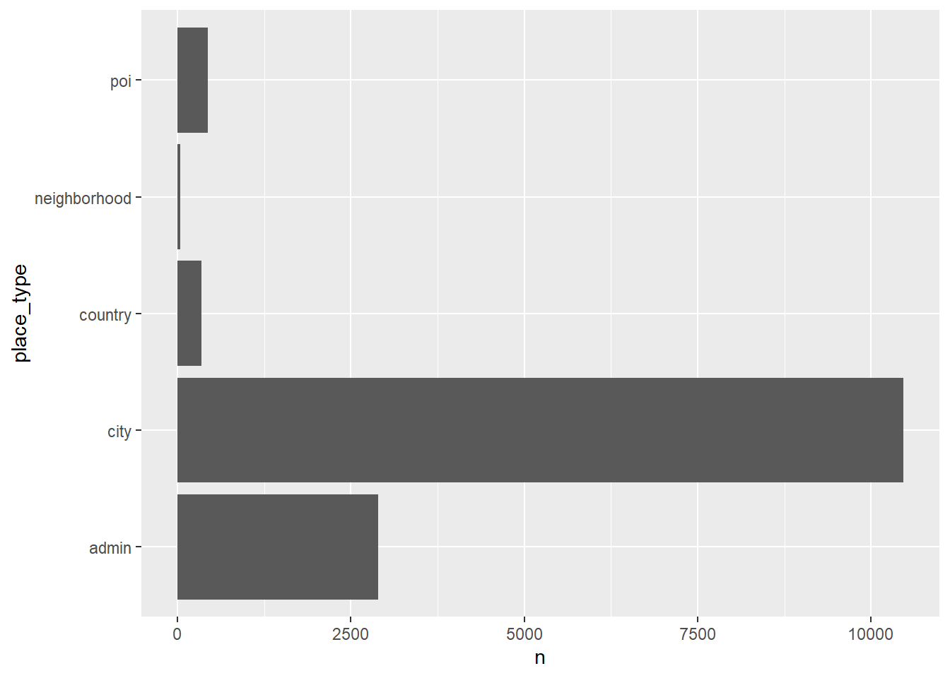
Twitter then translated the place name into a bounding box with four coordinate pairs, stored as a list of eight decimal numbers in bbox_coords. We will need to find the center of the bounding box by averaging the x coordinates and averaging the y coordinates.
In the code block below, convert the single bbox_coords column into one column for each coordinate.
Sample 5 of the resulting bbox_coords columns to determine which columns may be averaged to find the center of the bounding box.
## # A tibble: 5 × 8
##   bbox_coords_1 bbox_coords_2 bbox_coords_3 bbox_coords_4 bbox_coords_5
##           <dbl>         <dbl>         <dbl>         <dbl>         <dbl>
## 1         -82.5         -82.4         -82.4         -82.5          27.1
## 2         -81.3         -81.2         -81.2         -81.3          29.0
## 3         -83.7         -83.5         -83.5         -83.7          41.6
## 4         -81.3         -81.1         -81.1         -81.3          34.0
## 5         -95.7         -95.6         -95.6         -95.7          29.5
## # ℹ 3 more variables: bbox_coords_6 <dbl>, bbox_coords_7 <dbl>,
## #   bbox_coords_8 <dbl>
The minimum x coordinate (longitude) is stored in column bbox_coords_???
The maximum x coordinate (longitude) is stored in column bbox_coords_???
The minimum y coordinate (latitude) is stored in column bbox_coords_???
The maximum y coordinate (latitude) is stored in column bbox_coords_???
For only place names at least as precise as counties (poi, city, or neighborhood),
calculate the center coordinates in columns named bbox_meanx and bbox_meany.
It will be easier to find averages using simple math than to use rowwise and c_across for row-wise aggregate functions.
good_places <- c("poi", "city", "neighborhood")
dorian_geo_place <- dorian_geo_place |>
  mutate(bbox_meanx = case_when(place_type %in% good_places ~
                                  (bbox_coords_1 + bbox_coords_2) / 2),
         bbox_meany = case_when(place_type %in% good_places ~
                                  (bbox_coords_6 + bbox_coords_7) / 2)
         )
Sample 5 rows of the place type column and columns starting with bbox for tweets with non-NA place types to see whether the code above worked as expected.
dorian_geo_place |>
  filter(!is.na(place_type)) |>
  select(place_type, starts_with("bbox")) |>
  sample_n(5)
## # A tibble: 5 × 11
## place_type bbox_coords_1 bbox_coords_2 bbox_coords_3 bbox_coords_4
## <chr> <dbl> <dbl> <dbl> <dbl>
## 1 city -80.6 -80.4 -80.4 -80.6
## 2 city -74.3 -74.1 -74.1 -74.3
## 3 city -79.1 -78.9 -78.9 -79.1
## 4 admin -83.4 -78.5 -78.5 -83.4
## 5 city -85.9 -85.8 -85.8 -85.9
## # ℹ 6 more variables: bbox_coords_5 <dbl>, bbox_coords_6 <dbl>,
## # bbox_coords_7 <dbl>, bbox_coords_8 <dbl>, bbox_meanx <dbl>,
## # bbox_meany <dbl>To be absolutely sure, find the aggregate mean of bbox_meanx and bbox_meany by place_type
## # A tibble: 6 × 3
##   place_type   `mean(bbox_meanx)` `mean(bbox_meany)`
##   <chr>                     <dbl>              <dbl>
## 1 admin                      NA                 NA
## 2 city                      -80.9               35.7
## 3 country                    NA                 NA
## 4 neighborhood              -81.9               34.4
## 5 poi                       -78.8               34.7
## 6 <NA>                       NA                 NA
Finally, create xlng (longitude) and ylat (latitude) columns and populate them with coordinates, using geographic coordinates first and filling in with place coordinates second.
Hint: if none of the cases are TRUE in a case_when function, then .default = can be used at the end to assign a default value.
dorian_geo_place <- dorian_geo_place |>
  mutate(xlng = case_when(!is.na(geo_coords_2) ~ geo_coords_2,
                          .default = bbox_meanx),
         ylat = case_when(!is.na(geo_coords_1) ~ geo_coords_1,
                          .default = bbox_meany)
  )
Sample the xlng and ylat data along side the geographic coordinates and bounding box coordinates to verify. Re-run the code block until you find at least some records with geographic coordinates.
dorian_geo_place |>
  filter(!is.na(xlng)) |>
  select(xlng, ylat, geo_coords_1, geo_coords_2, bbox_meanx, bbox_meany, place_type) |>
  sample_n(5)
## # A tibble: 5 × 7
## xlng ylat geo_coords_1 geo_coords_2 bbox_meanx bbox_meany place_type
## <dbl> <dbl> <dbl> <dbl> <dbl> <dbl> <chr>
## 1 -79.3 43.6 NA NA -79.3 43.6 city
## 2 -81.6 41.5 NA NA -81.6 41.5 city
## 3 -77.0 38.9 NA NA -77.0 38.9 city
## 4 -76.9 34.9 NA NA -76.9 34.9 city
## 5 -71.5 41.8 NA NA -71.5 41.8 city12.3.4 Geographic point data
The sf pacakge allows us to construct geographic data according to open GIS standards, making tidyverse dataframes into geodataframes analagous to geopackages and shapefiles.
Select the status ID, created date-time, x and y coordinate columns.
Filter the data for only those Tweets with geographic coordinates.
Then, use the st_as_sf function to create geographic point data.
A crs is a coordinate reference system, and Geographic coordinates are generally stored in the system numbered 4326 (WGS 1984 geographic coordinates).
tweet_points <- dorian_geo_place |>
select(status_id, created_at, xlng, ylat) |>
filter(!is.na(xlng)) |>
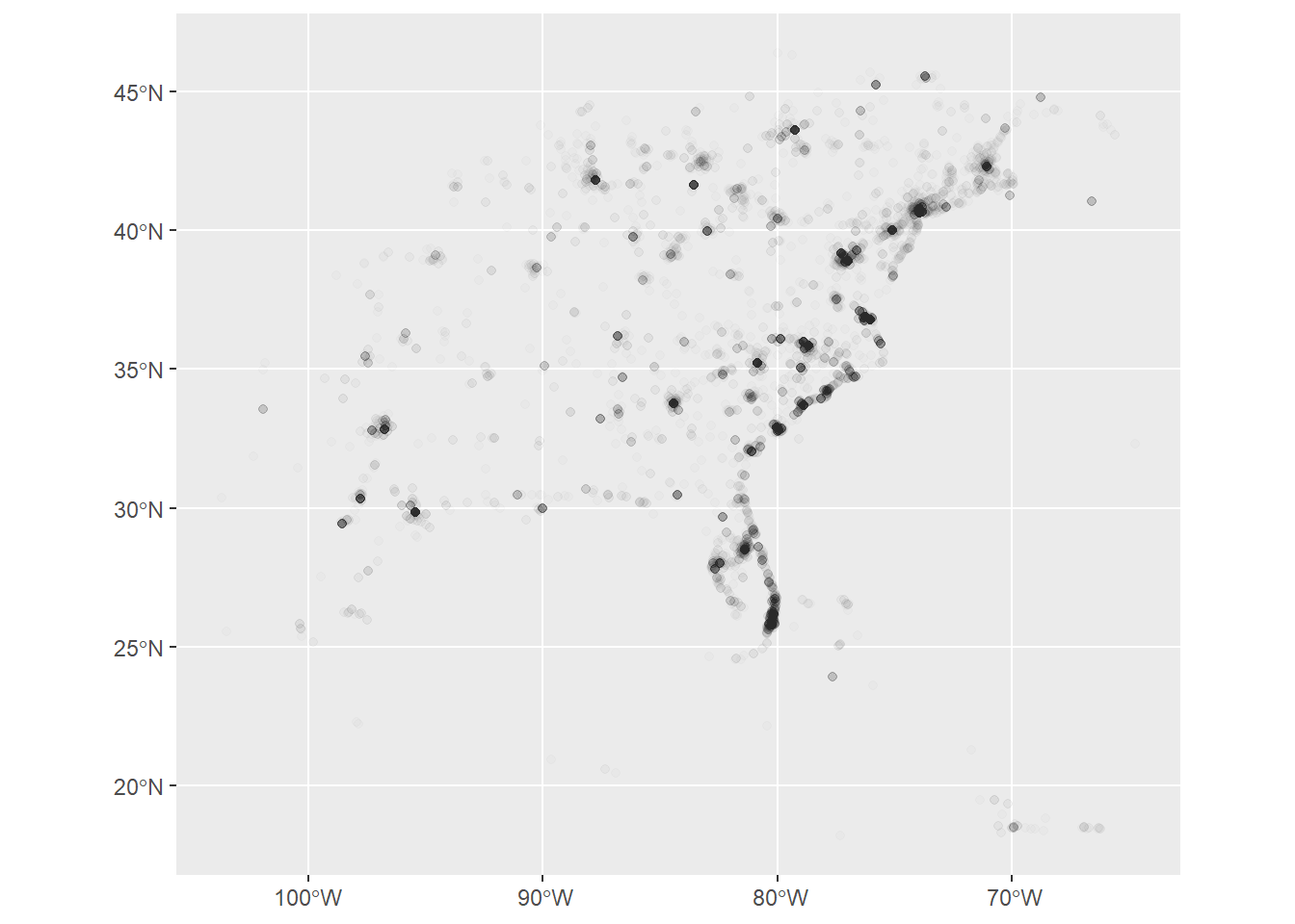
st_as_sf(coords = c("xlng", "ylat"), crs = 4326)Graph (map) the tweets!
12.3.5 Aquire Census data
For details on the variables, see https://api.census.gov/data/2020/dec/dp/groups/DP1.html
countyFile <- here("data_public", "counties.RDS")
censusVariablesFile <- here("data_public", "census_variables.csv")

if(!file.exists(countyFile)){
  counties <- get_decennial(
    geography = "county",
    table = "DP1",
    sumfile = "dp",
    output = "wide",
    geometry = TRUE,
    keep_geo_vars = TRUE,
    year = 2020
  )

saveRDS(counties, countyFile)

census_variables <- load_variables(2020, dataset="dp")

write_csv(census_variables, censusVariablesFile)

} else{
  counties <- readRDS(countyFile)
  census_variables <- read_csv(censusVariablesFile)
}
## Rows: 320 Columns: 3
## ── Column specification ─────────────────────────────────────────────
## Delimiter: ","
## chr (3): name, label, concept
##
## ℹ Use `spec()` to retrieve the full column specification for this data.
## ℹ Specify the column types or set `show_col_types = FALSE` to quiet this message.12.3.6 Select counties of interest
select only the states you want, with FIPS state codes look up fips codes here: https://en.wikipedia.org/wiki/Federal_Information_Processing_Standard_state_code
12.3.7 Map population density and tweet points
Calculate population density in terms of people per square kilometer of land.
DP1_0001C is the total population
ALAND is the area of land in square meters
Map population density
We can use ggplot, but rather than the geom_ functions we have seen before for the data geometry, use geom_sf for our simple features geographic data.
cut_interval is an equal interval classifier, while cut_number is a quantile / equal count classifier function.
Try switching between the two and regraphing the map below.
ggplot() +
  geom_sf(data = counties,
    aes(fill = cut_number(popdensity, 5)), color = "grey") +
  scale_fill_brewer(palette = "GnBu") +
guides(fill = guide_legend(title = "Population Density")) 
Add twitter points to the map as a second geom_sf data layer.
ggplot() +
  geom_sf(data = counties,
    aes(fill = cut_number(popdensity, 5)), color = "grey") +
  scale_fill_brewer(palette = "GnBu") +
  guides(fill = guide_legend(title = "Population Density")) +
  geom_sf(data = tweet_points,
    colour = "purple", alpha = 0.05, size = 1
  ) +
labs(title = "Tweet Locations After Hurricane Dorian") 
12.3.8 Join tweets to counties
- Spatial functions for vector geographies almost universally start with
st_ - Twitter data uses a global geographic coordinate system (WGS 1984, with code
4326) - Census data uses North American geographic coordinates (NAD 1987, with code
4269) - Before making geographic comparisons between datasets, everything should be stored in the same coordinate reference system (crs).
st_crschecks the coordinate reference system of geographic datast_transformmathematically translates coordinates from one system to another.
Transform Tweet points into the North American coordinate system and then check their CRS.
## Coordinate Reference System:
##   User input: EPSG:4269
##   wkt:
## GEOGCRS["NAD83",
##     DATUM["North American Datum 1983",
##         ELLIPSOID["GRS 1980",6378137,298.257222101,
##             LENGTHUNIT["metre",1]]],
##     PRIMEM["Greenwich",0,
##         ANGLEUNIT["degree",0.0174532925199433]],
##     CS[ellipsoidal,2],
##         AXIS["geodetic latitude (Lat)",north,
##             ORDER[1],
##             ANGLEUNIT["degree",0.0174532925199433]],
##         AXIS["geodetic longitude (Lon)",east,
##             ORDER[2],
##             ANGLEUNIT["degree",0.0174532925199433]],
##     USAGE[
##         SCOPE["Geodesy."],
##         AREA["North America - onshore and offshore: Canada - Alberta; British Columbia; Manitoba; New Brunswick; Newfoundland and Labrador; Northwest Territories; Nova Scotia; Nunavut; Ontario; Prince Edward Island; Quebec; Saskatchewan; Yukon. Puerto Rico. United States (USA) - Alabama; Alaska; Arizona; Arkansas; California; Colorado; Connecticut; Delaware; Florida; Georgia; Hawaii; Idaho; Illinois; Indiana; Iowa; Kansas; Kentucky; Louisiana; Maine; Maryland; Massachusetts; Michigan; Minnesota; Mississippi; Missouri; Montana; Nebraska; Nevada; New Hampshire; New Jersey; New Mexico; New York; North Carolina; North Dakota; Ohio; Oklahoma; Oregon; Pennsylvania; Rhode Island; South Carolina; South Dakota; Tennessee; Texas; Utah; Vermont; Virginia; Washington; West Virginia; Wisconsin; Wyoming. US Virgin Islands. British Virgin Islands."],
##         BBOX[14.92,167.65,86.45,-40.73]],
## ID["EPSG",4269]]- Here, we want to map the number, density, or ratio of tweets by county.
- Later on, we may want to filter tweets by their location, or which county and state they are in.
- For both goals, the first step is to join information about counties to individual tweets.
- You’ve already seen data joined by column attributes (GDP per capita and life expectancy by country and year) using
left_join. Data can also be joined by geographic location with a spatial version,st_join. If you look up the default parameters ofst_join, it will be a left join with the join criteria st_intersects.
But first, which columns from counties should we join to tweet_points, if we ultimately want to re-attach tweet data to counties and we might want to filter tweets by state or by state and by county?
Hint for those unfamiliar with Census data, the Census uses GEOIDs to uniquely identify geographic features, including counties.
County names are not unique: some states have counties of the same name.
Select the GEOID and useful county and state names from counties, and join this information to tweet points by geographic location.
In the select below, = is used to rename columns as they are selected.
Display a sample of the results and save these useful results as an RDS file.
counties_select_columns <- counties |>
  select(GEOID, county = NAME.x, state = STATE_NAME)

tweet_points <- tweet_points |> st_join(counties_select_columns)

tweet_points |> sample_n(5)
## Simple feature collection with 5 features and 5 fields
## Geometry type: POINT
## Dimension: XY
## Bounding box: xmin: -82.76477 ymin: 36.84176 xmax: -69.82584 ymax: 43.90888
## Geodetic CRS: NAD83
## # A tibble: 5 × 6
## status_id created_at geometry GEOID county state
## * <chr> <dttm> <POINT [°]> <chr> <chr> <chr>
## 1 117055457755… 2019-09-08 04:28:53 (-69.82584 43.90888) 23023 Sagadahoc Maine
## 2 117013477001… 2019-09-07 00:40:43 (-82.76477 39.97482) 39089 Licking Ohio
## 3 116967038334… 2019-09-05 17:55:25 (-76.35592 36.84176) 51740 Portsmouth Virgi…
## 4 116997307936… 2019-09-06 13:58:13 (-79.27257 43.62931) <NA> <NA> <NA>
## 5 117002116673… 2019-09-06 17:09:18 (-79.27257 43.62931) <NA> <NA> <NA>Pro Tips:
- If you join data more than once (e.g. by re-running the same code block), R will create duplicate field names and start adding suffixes to them (e.g.
.x,.y). If this happens to you, go back and recreate the data frame and then join only once. - Once a data frame is geographic, the geometry column is sticky: it stays with the data even if it is not explicitly selected. The only way to be rid of it is with a special
st_drop_geometry()function. Fun fact: you cannot join two data frames by attribute (e.g. throughleft_join()) if they both have geometries.
Now, count the number of tweets per county and remove the geometry column as you do so.
## # A tibble: 602 × 2
##    GEOID     n
##    <chr> <int>
##  1 01001     1
##  2 01003     5
##  3 01007     2
##  4 01015     6
##  5 01017     1
##  6 01021     1
##  7 01043     1
##  8 01045     1
##  9 01047     1
## 10 01051     3
## # ℹ 592 more rows
Join the count of tweets to counties and save counties with this data.
counties_tweet_counts <- counties |>
  left_join(tweet_counts, by = "GEOID")

counties_tweet_counts |>
  select(-starts_with(c("DP1", "A")), -ends_with("FP")) |>
  sample_n(5)
## Simple feature collection with 5 features and 10 fields
## Geometry type: MULTIPOLYGON
## Dimension: XY
## Bounding box: xmin: -88.36278 ymin: 32.5842 xmax: -78.03319 ymax: 41.37651
## Geodetic CRS: NAD83
## # A tibble: 5 × 11
## COUNTYNS GEOID NAME.x NAMELSAD STUSPS STATE_NAME LSAD NAME.y
## * <chr> <chr> <chr> <chr> <chr> <chr> <chr> <chr>
## 1 01480124 51069 Frederick Frederick County VA Virginia 06 Frederick…
## 2 00161554 01057 Fayette Fayette County AL Alabama 06 Fayette C…
## 3 01213674 42065 Jefferson Jefferson County PA Pennsylvania 06 Jefferson…
## 4 00424241 17079 Jasper Jasper County IL Illinois 06 Jasper Co…
## 5 00346824 13319 Wilkinson Wilkinson County GA Georgia 06 Wilkinson…
## # ℹ 3 more variables: geometry <MULTIPOLYGON [°]>, popdensity <dbl>, n <int>12.3.9 Calculate county tweet rates
Calculate the tweet_rate as tweets per person.
Many counties remain NA because they had no tweets.
Rather than missing data, this actually means there are zero tweets.
Therefore, convert NA to 0 using replace_na() before calculating the tweet rate.
counties_tweet_counts <- counties_tweet_counts |>
  mutate(
    n = replace_na(n, 0),
    tweet_rate = n / DP1_0001C * 10000
    )

counties_tweet_counts |>
  select(-starts_with(c("DP1", "A")), -ends_with("FP")) |>
  sample_n(5)
## Simple feature collection with 5 features and 11 fields
## Geometry type: MULTIPOLYGON
## Dimension: XY
## Bounding box: xmin: -94.61409 ymin: 34.91246 xmax: -82.2613 ymax: 38.8525
## Geodetic CRS: NAD83
## # A tibble: 5 × 12
## COUNTYNS GEOID NAME.x NAMELSAD STUSPS STATE_NAME LSAD NAME.y
## * <chr> <chr> <chr> <chr> <chr> <chr> <chr> <chr>
## 1 00424252 17101 Lawrence Lawrence County IL Illinois 06 Lawrenc…
## 2 00069907 05147 Woodruff Woodruff County AR Arkansas 06 Woodruf…
## 3 00516902 21111 Jefferson Jefferson County KY Kentucky 06 Jeffers…
## 4 00758461 29013 Bates Bates County MO Missouri 06 Bates C…
## 5 01008562 37089 Henderson Henderson County NC North Carolina 06 Henders…
## # ℹ 4 more variables: geometry <MULTIPOLYGON [°]>, popdensity <dbl>, n <int>,
## # tweet_rate <dbl>Show a table of the county name and tweet rate for the 10 counties with the highest rates
counties_tweet_counts |>
  arrange(desc(tweet_rate)) |>
  select(NAME.y, tweet_rate) |>
  st_drop_geometry() |>
  head(10)
## # A tibble: 10 × 2
## NAME.y tweet_rate
## <chr> <dbl>
## 1 Dare County, North Carolina 12.7
## 2 Carteret County, North Carolina 11.2
## 3 Nantucket County, Massachusetts 11.2
## 4 Hyde County, North Carolina 8.72
## 5 Georgetown County, South Carolina 7.26
## 6 Charleston County, South Carolina 6.52
## 7 Horry County, South Carolina 5.95
## 8 Brunswick County, North Carolina 5.93
## 9 New Hanover County, North Carolina 5.58
## 10 Worcester County, Maryland 5.53Should we multiply the tweet rate by a constant, so that it can be interpreted as, e.g. tweets per 100 people? What constant makes the best sense? Adjust and re-run the rate calculation code block above and note the rate you have chosen.
Save the counties data with Twitter counts and rates
12.3.10 Map tweet rates by county
Make a choropleth map of the tweet rates!
ggplot() +
  geom_sf(data = counties_tweet_counts,
    aes(fill = cut_interval(tweet_rate, 7)), color = "grey") +
  scale_fill_brewer(palette = "GnBu") +
guides(fill = guide_legend(title = "Tweets per 10,000 People")) 
12.3.11 Conclusions
Many things here could still be improved upon! We could…
- Use regular expressions to filter URLs, user handles, and other weird content out of Tweet Content.
- Combine state names into single words for analysis, e.g. NewYork, NorthCarolina using
str_replace - Calculate sentiment of each tweet
- Draw word clouds in place of bar charts of the top most frequent words
- Geocode profile location descriptions in order to map more content
- Animate our map of tweets or our graphs of word frequencies by time
- Switch from using
ggplotfor cartography to usingtmap
For the second assignment, by afternoon class on Tuesday:
- Complete and knit this Rmd
- To the conclusions, add two or three ideas about improvements or elements of interactivity that we could add to this analysis.
- Research and try to implement any one of the improvements suggested. This part will be evaluated more based on effort than on degree of success: try something out for 1-2 hours and document the resources you used and what you learned, whether it ultimately worked or not.
12.4 Map hurricane tracks with tmap
Install new spatial packages
Load packages
Let’s use the tmap package for thematic mapping.
https://r-tmap.github.io/tmap/
Note that tmap is rolling out a new version, so some of the online documentation is ahead of the package installed by default.
12.5 Acquire hurricane track data
First, download NA (North Atlantic) point and line shapefiles from: https://www.ncei.noaa.gov/products/international-best-track-archive (go to the shapefiles data: https://www.ncei.noaa.gov/data/international-best-track-archive-for-climate-stewardship-ibtracs/v04r01/access/shapefile/ , and find the two files with “NA” for North America: points and lines) Unzip the contents (all 4 files in each zip) into your data_private folder.
Read in the lines data
## Reading layer `IBTrACS.NA.list.v04r01.lines' from data source
##   `C:\GitHub\opengisci\wt25_josephholler\data_private\IBTrACS.NA.list.v04r01.lines.shp'
##   using driver `ESRI Shapefile'
## Simple feature collection with 124915 features and 179 fields
## Geometry type: LINESTRING
## Dimension:     XY
## Bounding box:  xmin: -136.9 ymin: 7 xmax: 63 ymax: 83
## Geodetic CRS:  WGS 84
Filter for 2019, and for Dorian specifically.
tracks2019 <- hurricaneTracks |> filter(SEASON == 2019)
dorianTrack <- tracks2019 |> filter(NAME == "DORIAN")
Load hurricane points
## Reading layer `IBTrACS.NA.list.v04r01.points' from data source
##   `C:\GitHub\opengisci\wt25_josephholler\data_private\IBTrACS.NA.list.v04r01.points.shp'
##   using driver `ESRI Shapefile'
## Simple feature collection with 127219 features and 179 fields
## Geometry type: POINT
## Dimension:     XY
## Bounding box:  xmin: -136.9 ymin: 7 xmax: 63 ymax: 83
## Geodetic CRS:  WGS 84
Filter for Dorian in 2019
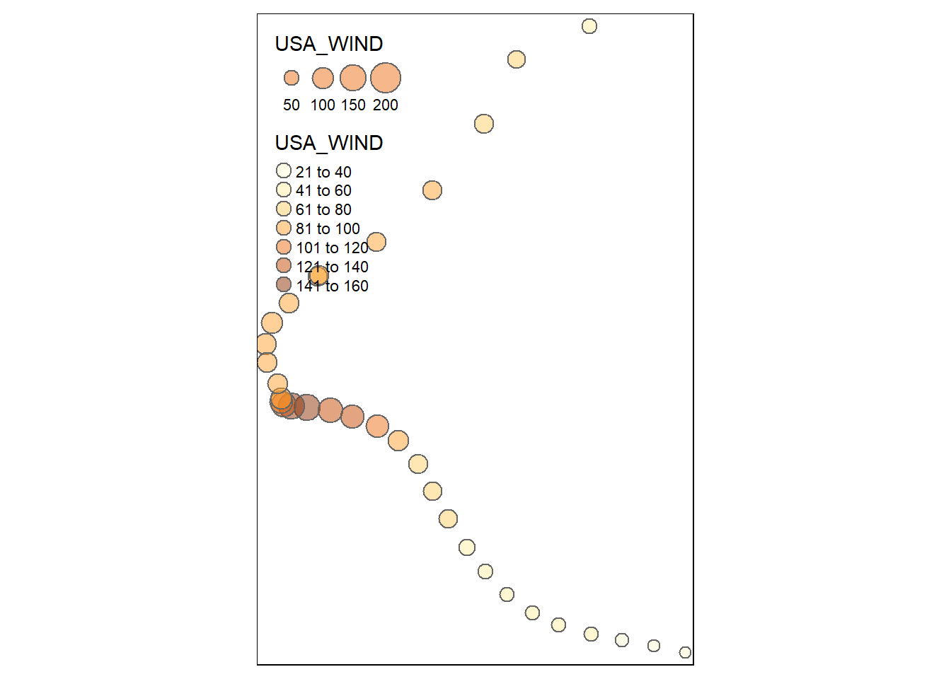
12.7 Map Hurricane Dorian track
The plot mode produces a static map.
The width of lines can represent the wind speed.
## tmap mode set to plotting## Legend labels were too wide. Therefore, legend.text.size has been set to 0.64. Increase legend.width (argument of tm_layout) to make the legend wider and therefore the labels larger.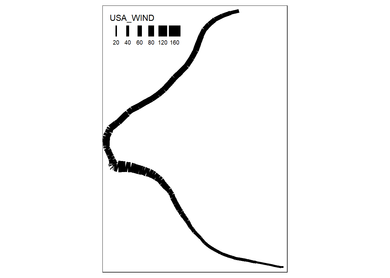
The size of bubbles can also represent wind speed. We can produce a more legible map by filtering for one point every 12 hours.
dorianPoints <- dorianPoints |>
  mutate(hour = hour(as.POSIXlt(ISO_TIME)))

dorian6hrPts <- dorianPoints |>
  filter(hour %% 12 == 0)

tmap_mode(mode = "plot")
tm_shape(dorian6hrPts) +
  tm_bubbles("USA_WIND",
             col = "USA_WIND",
             alpha = 0.5)